TL;DR: key takeaways
- A professional certificate has ten elements: the issuer’s logo, a title, the recipient’s name, an achievement statement, dates, signatures, a seal, a credential ID, a verification link or QR code, and a border.
- Hierarchy does most of the work: the recipient’s name is the largest text, the logo stays modest, and nothing crowds the edges.
- Use two fonts at most, a classic serif for the title and name and a plain sans serif for the rest, with a text contrast of at least 4.5:1.
- Design for screen and paper at once: US Letter or A4 landscape for print, a layout that still reads on a phone, and room for longer translations.
- Borders, seals and signatures make a certificate look official. Only a credential ID and a verification link let an employer prove it is genuine.
Certificate design is the work of arranging a certificate’s text, logo, signatures, seal and border so that it looks official, reads at a glance and can be checked by anyone who receives it. For an issuer, whether a university, a business school, a training provider or an awarding body, it is also a trust decision: the certificate is what a learner will frame, print, post on LinkedIn and send to employers, sometimes years after the course.
Looking official and being genuine are two different things. The UK’s official degree verification service, Hedd, has helped regulators identify more than 400 bogus institutions (Jisc), and a convincing layout is the easiest part of a fake to copy. This guide covers what to put on a certificate, how to lay it out, which fonts, borders and sizes work, and how to build verification into the design. For ready-made layouts, browse our certificate templates.
What should be included on a certificate?
Every certificate, from a degree to a half-day workshop, needs the same core information. A reader should be able to answer four questions in a few seconds: who issued it, to whom, for what, and when.
| Element | What it tells the reader | Design tip |
|---|---|---|
| Issuer name and logo | Who awards the credential | Top center or top left, smaller than the title |
| Certificate title | The type of credential: certificate of completion, diploma, award | Second-largest text; name the credential, not just “Certificate” |
| Recipient’s name | Who earned it | The largest text on the page; check that long names and accents fit |
| Achievement statement | What was completed, with hours, grade or level if relevant | One or two short lines in the body font |
| Dates | Date of issue and, for credentials that must be renewed, the expiry date | Write the month in letters: 06/07/2026 is June 7 in the US and 6 July in Europe |
| Signatures | Who vouches for it, with each signer’s name and role | One or two, aligned along the bottom |
| Seal or emblem | The institution’s official mark | Between or beside the signatures, never over text |
| Credential ID | A unique reference for this certificate | Small but legible, near the bottom edge |
| Verification link or QR code | Where anyone can check the certificate | A bottom corner, with the address in plain text next to the code |
| Accreditation (optional) | The body or framework that recognizes the credential | A short line or logo in the footer |
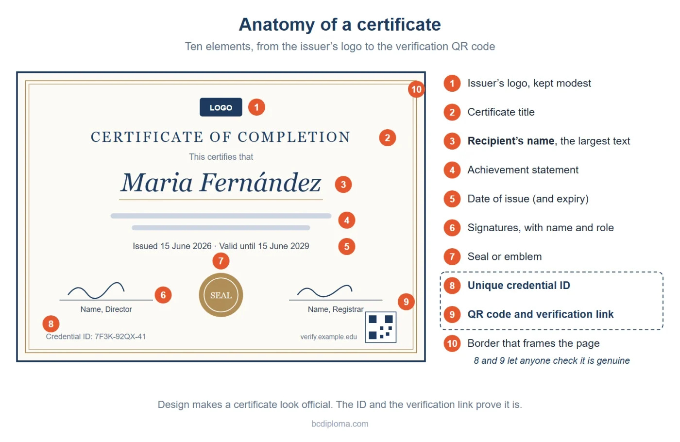
The logo, title, signatures and seal make a certificate look official. The credential ID and the verification link make it verifiable: without a credential ID and a place to check it, an employer has to email you or take the document at face value.
How to design a certificate, step by step
Whether you use a design tool, a template or a credential platform, the decisions come in the same order:
- Define the credential. Note its type (degree, completion, professional certification, award), who receives it and whether it expires. A diploma calls for a formal design; a one-day workshop certificate can be lighter.
- Gather your brand assets. Get the logo as an SVG or a high-resolution PNG, your brand colors with their codes, and signatures scanned on a white background.
- Choose the format. Pick the orientation and paper size first (see the size table below), so you don’t have to redesign for print later.
- Set the hierarchy. Decide what the eye reads first (the name), second (the title) and third (the issuer and the achievement), and size the text in that order.
- Choose two fonts and your colors, then check the contrast between text and background.
- Add the official elements: border, seal and signatures.
- Add the verification elements: credential ID, QR code and verification link.
- Test with real data: the longest name in your list, names with accents, a two-line course title. Print one copy and open one on a phone.
Certificate layout: orientation, hierarchy and white space
Most certificates use a landscape layout with a centered, symmetrical structure: logo at the top, then the title, the name and the achievement statement, with dates, signatures and seal along the bottom. Symmetry reads as formal. An off-center layout with a band of color down one side reads as modern and suits training and corporate certificates. Portrait works for documents with more text, such as some diplomas and transcripts.
- One focal point: the recipient’s name, usually two to three times the size of the body text. If the logo or the title competes with it, make them smaller.
- Margins: keep every text element well inside the border. For a professional print run, ask your print shop for its safe zone, the strip inside the trim line where nothing important should sit.
- White space: leave room around the name and between blocks. A crowded certificate looks less official, not more.
- Alignment: put the signatures and the seal on one baseline, and center the text blocks on the same axis.
In BCdiploma, templates use one-, two- or three-column layouts, so the same certificate can keep the name and the achievement in a main column and put details such as skills or grades in a side column.
What are the best fonts for certificates?
The best font for a certificate reads instantly and matches the tone of the credential. Use two fonts at most: one with character for the title and the name, and a plain one for everything else.
| Use | Font style | Free examples (Google Fonts) |
|---|---|---|
| Title | Classic serif or engraved capitals | Cinzel, Playfair Display, EB Garamond |
| Recipient’s name | Serif, or a script used with care | Libre Baskerville, Cormorant Garamond; script: Great Vibes (short names only) |
| Body text, dates and ID | Sans serif or a simple serif | Montserrat, Lato, Source Sans 3, Open Sans |
- Keep scripts for the name. A calligraphic font makes capital letters and accented names hard to read, so test it with real names before you commit.
- Check the character set. If you issue certificates to international learners, the font must include accented letters (é, ñ, ç, ø) and any other scripts you need. A missing character prints as an empty box or switches to another font in the middle of a name.
- Check the license. A certificate shown as a web page or a PDF embeds its fonts. All Google Fonts are open source and can be used commercially, most of them under the SIL Open Font License (Google Fonts FAQ); a commercial font may need a web or app license.
- Check contrast and size. The Web Content Accessibility Guidelines ask for a contrast ratio of at least 4.5:1 for normal text and 3:1 for large text (WCAG 2.2). Pale gold or gray text on a cream background is the first combination to test.
Certificate borders, seals and backgrounds
Borders, seals and backgrounds give a certificate its official look. Used with restraint, they frame the content; overdone, they bury it.
Certificate borders
A border frames the page and gives the eye an edge. Classic options are a double rule, a guilloche pattern (the fine interlaced lines used on banknotes) or an ornamental frame. Modern certificates often use a single thin line or a band of color on one side. Keep the border in one of your brand colors, leave clear space between it and the text, and keep it inside the printer’s safe zone. Avoid clip-art frames: they appear on thousands of free templates and make a certificate look generic.
Certificate seals
A seal is the institution’s official mark. On paper, it can be embossed or added in foil after printing. On a digital certificate, a seal is an image, and an image can be copied: it signals authority but proves nothing. Use your real emblem or crest rather than a stock gold rosette, and place it between or beside the signatures.
Certificate backgrounds
A background adds texture or a faint watermark of your crest. Keep it light and low in contrast, and test your darkest and lightest text over the busiest part of the image. For print, export the background at its final size at 300 dpi, the resolution print shops usually ask for: 3,300 × 2,550 pixels for US Letter landscape, 3,508 × 2,480 pixels for A4 landscape.
What size is a certificate?
Most certificates use the standard paper size of their market: US Letter in North America, A4 almost everywhere else. Diplomas are often larger, and their size varies from one institution to another: the University of Chicago issues diplomas at 9 × 12 inches (University Registrar), Case Western Reserve University at 11 × 14 inches (Commencement).
| Format | Size | Typical use |
|---|---|---|
| US Letter, landscape | 11 × 8.5 in (279 × 216 mm) | Certificates in the US, Canada and Mexico |
| A4, landscape | 297 × 210 mm (11.7 × 8.3 in) | Certificates in Europe, Brazil and most other markets |
| 9 × 12 in | 229 × 305 mm | Diplomas, for example at the University of Chicago |
| 11 × 14 in | 279 × 356 mm | Diplomas, for example at Case Western Reserve University |
| Screen | Responsive web page or PDF | Digital certificates opened on a phone or a laptop |
Standard sizes are easier for everyone: frames and folders are easy to find, and recipients can print a copy at home. For a professional print run, ask your print shop for its bleed and safe-zone requirements and send a print-ready PDF with crop marks. Design in RGB for screens and let the print-ready export handle the conversion, or ask the print shop which color profile it wants.
How do you design a certificate for screen and print at the same time?
Most certificates are now seen on a screen first: in an email, on a phone, on a LinkedIn profile. Many are also printed for a ceremony or a frame. A design built for one format often breaks in the other.
- On a phone: the name and title must stay legible without zooming. A certificate displayed as a web page can adapt to the screen; a fixed image or PDF can’t.
- As a thumbnail: when the certificate is shared on social media or shown in an email preview, it appears at a fraction of its size. The title and the issuer should still be readable there.
- On paper: colors print darker than they look on screen, and hairlines and pale tints can disappear. Print a test copy on the paper you’ll use.
- In several languages: plan room for longer text. French, Spanish and Portuguese translations often run longer than the English original, and a title that fits on one line in English may need two.
BCdiploma certificates are web pages that display the certificate, its data and its verification on any screen, and one template can carry several languages that the viewer switches between. The same certificate exports to a standard PDF or to a print-ready PDF with crop marks and bleed, and every printed copy carries a QR code linked to its digital version (certificate printing).
How do you make a certificate verifiable?
A well-designed certificate is still easy to copy. Anyone with an image editor can change the name on a PDF or reproduce a seal. What makes a certificate trustworthy is a way to check it against the issuer’s own record, and that has to be part of the design from the start:
- A unique credential ID printed on the certificate, so a verifier can quote it.
- A QR code that opens the certificate’s verification page. Leave a clear margin around it, print it large enough to scan from paper, and test it with a few phones.
- A verification address in plain text next to the code, for people reading a PDF on a computer.
- Your own domain on the verification page, so the employer sees your institution’s name rather than an unfamiliar website (white-label credentials).
- A record that can’t be quietly edited, such as a cryptographic signature or a blockchain anchor, so an altered copy no longer matches the original.
For the technical side, read what makes a digital certificate verifiable, and see how employers verify an online certificate.
Certificate design examples by type
The type of credential sets the tone. Here is how the same elements change from one certificate to another:
| Certificate type | Tone and layout | What to add |
|---|---|---|
| Degree or diploma | Formal and symmetrical, serif fonts, crest and seal, often a larger format | Degree and field of study, honors, the signatures of authorized officers |
| Certificate of completion | Clean, in brand colors, landscape | Course name, hours or credits, completion date |
| Professional certification | Formal but modern; the status matters more than the decoration | Certification number, expiry date, accrediting body |
| Award or recognition | More decorative; borders and color are welcome | Reason for the award, the event or year |
| Attendance or participation | Light and simple | Event name, date, hours attended |
| Micro-credential or digital badge | A badge image plus a credential page | Skills, criteria and evidence, following the Open Badges standard |
For more, see our guides to the certificate of completion and to digital badge design, or browse graduation certificate templates and credentials issued by our customers.
Common certificate design mistakes to avoid
Most of these are small, but each one makes a certificate harder to read or harder to trust:
- Too many fonts, or a script font used for the whole text.
- A name that doesn’t fit. A design tested with a short name breaks with a 35-character name or a double surname.
- Missing characters: accents replaced by boxes or by another font.
- Low contrast: pale gold or gray text on a cream or patterned background.
- A blurry or stretched logo: a low-resolution file looks fine on screen and blurs in print.
- Ambiguous dates written only in numbers.
- Stock decoration: generic seals, ribbons and frames from free templates.
- Typos in the title, the course name or a signer’s role.
- No way to check it: no credential ID, no QR code, no verification link.
Design and issue verifiable certificates with BCdiploma
With BCdiploma, you can create a certificate template in a few minutes, starting from predefined designs and one-, two- or three-column layouts, with your logo, colors, images and text in several languages. For diplomas and complex certificates, our team designs a fully custom template with you. A source template can then be duplicated into as many variations as you need, each with its own texts, logos or signatures.
Every certificate is secured by a patented blockchain system and can be verified in one click, with no account. The platform is certified for Open Badges 3.0 by 1EdTech and meets accessibility standards including WCAG, RGAA 4 and EN 301 549. Browse our certificate templates, see how printed certificates are verified, or start a free trial.
Frequently asked questions
Contact us for more information.
A certificate should include the issuer’s name and logo, a title, the recipient’s name, a short achievement statement, the date of issue (and the expiry date if it must be renewed), signatures with each signer’s name and role, and a seal. To make it verifiable, add a unique credential ID and a verification link or QR code.
Use two fonts at most: a classic serif such as Playfair Display, EB Garamond or Cinzel for the title and the name, and a plain sans serif such as Montserrat or Lato for the rest. Keep script fonts for the recipient’s name only, and test them with long and accented names.
Most certificates are US Letter (11 × 8.5 inches) in North America and A4 (297 × 210 mm) elsewhere, usually in landscape. Diplomas are often larger, such as 9 × 12 or 11 × 14 inches, depending on the institution.
Landscape is the most common choice: it reads as formal and leaves room for long names and signatures side by side. Portrait suits documents with more text, such as some diplomas and transcripts. Choose one orientation per program and keep it.
Use your real logo and emblem, a formal serif title, signatures with names and roles, a seal and a restrained border, and leave plenty of white space. To make it verifiable as well as official, add a credential ID and a verification link or QR code.
Use 300 dpi at the final size: 3,300 × 2,550 pixels for US Letter landscape and 3,508 × 2,480 pixels for A4 landscape. Supply logos as vector files (SVG) when possible.
Yes. A digital certificate can be exported as a PDF and printed at home, or as a print-ready PDF with crop marks and bleed for a print shop. A QR code on the printed copy links it back to the digital version, so it can still be verified.

